

Qual é a importância do UX Design?

How to influence user behavior: methods

Como influenciar o comportamento dos usuários

Improve sales with UX Design

How UX Writing helps the design process

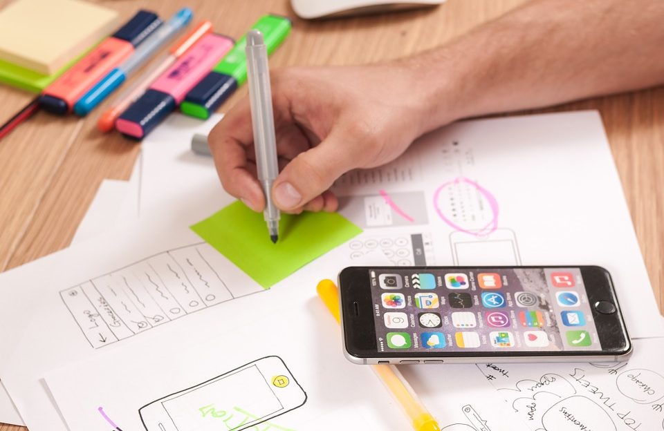
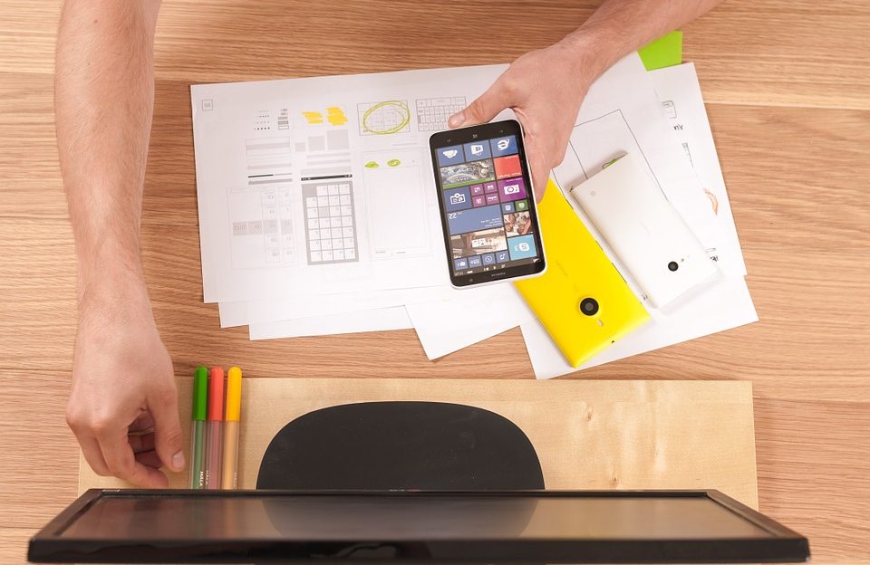
Mobile UX Design: optimize your mobile website
When designing a website, we must pay attention to adapting to mobile devices. Nowadays, it is unthinkable to have a site that doesn't work on smartphones and tablets, as people increasingly use these devices instead of computers. So in this article we give you a checklist to keep in mind when creating a mobile UX Design strategy.
Mobile UX Design: Checklist
Everything has to be touch friendly
What does this mean? All the features of your website must be easy to touch. Therefore, as people are not using a computer mouse, you need to take this into account.
All call to action buttons and CTAs must be large enough
On smaller screens, it may be more difficult to see what is written and the buttons people should click on. Also, if they are too small, it is difficult to click on them.
Text must be readable
As in the previous point, make sure that it is easy to read the text on the smartphone. Not a good sign when users have to increase content to read.
Interaction buttons should be easily accessible
Place all menus, call to actions, and other buttons in visible, easily accessible locations on the screen area.
The least essential elements should be in the footer
Terms and conditions, business location, contacts, values, and similar information should be in the footer. Remember that the most important and flashy information must be above.
Do not put text on images
Text images are harder to read on smartphones.
Show off your pictures on a carousel
This will increase the interaction, as it will be much more interesting to view your images on a mobile device.
Small Contact Forms
Make people have to write as little as possible, because it's harder to write on a smartphone or tablet!
With these tips, your mobile UX Design strategy will be more successful!

Facts about users that every single UX Designer must know

Factos sobre os usuários que todo o UX Designer deve conhecer


