Our minds are programmed to react to colours; they shape our emotions and our thoughts. Studies confirm that colours not only affect our mood, but also our buying habits. Therefore, it is very important to know what colour psychology is.
Colour Psychology in Marketing and UX Design
Being directly attached to the vision, colours stimulate the brain and provoke immediate reactions. Therefore, colour psychology is widely used in Marketing and Design. Studies claim that colours stimulate areas of the brain that both develop excitement and tranquillity, for example. So companies, especially the larger ones, can influence their target audience by simply combining the right colours.
Neil Patel and Ritika Puri wrote a comprehensive guide in which we can understand these issues related to colour psychology (The Complete Guide to Understanding Consumer Psychology). In this guide, the authors explain that:
- It is important because consumers value colour and visual appearance immensely when they buy;
- 85% of buyers place colour as the main reason why they buy a particular product;
- Colour enhances brand recognition by 80%. Brand recognition is directly linked to consumer confidence.
Although the perception of colour is subjective, some colours have universal meanings. Colours fall into three categories: cool, warm and neutral. Therefore, in colour psychology, it is advised to use one colour from each group to have a more effective effect on the consumer’s mind. Let’s see what the meaning of each colour is.
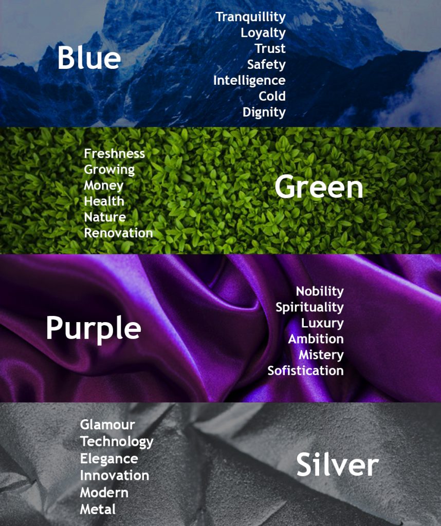
Cool colours
Cool colours represent calm and tranquillity. However, they may also represent coldness or impersonality. Therefore, you should use them with warm or neutral colours.
Blue: it is a sober and less intrusive colour, which can strengthen the confidence of the customers in relation to the brand.
Green: colour used in hospitals, because it refers to health and freshness. In corporate environments, the idea of preponderance and coherence passes.
Purple: It is widely used in SPAs, beauty clinics, beauty products and other wellness businesses. Purple is also used to refer to spirituality.
Silver: Silver is associated with technology, innovation and modernity. It is widely used by technology companies.
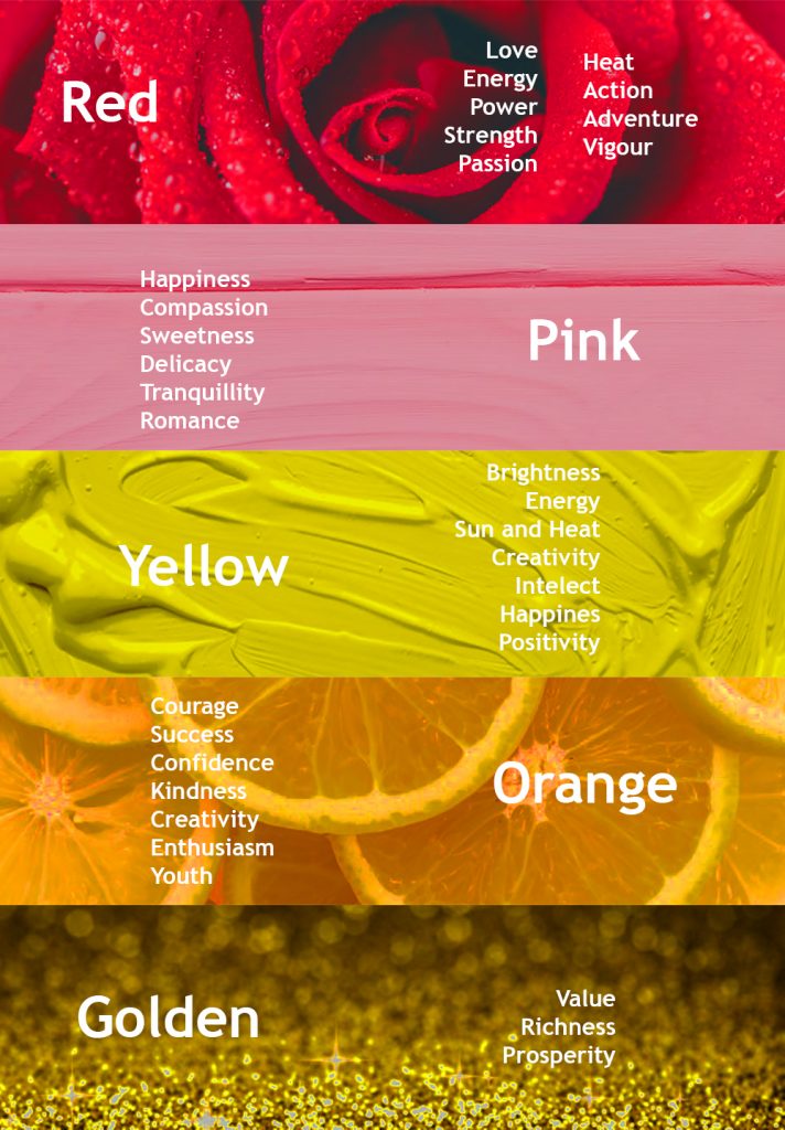
Warm colours
Warm colours tend to trigger strong emotions, such as energy, vigour, etc. However, when using only warm colours, you may cause undesirable emotions, such as irritation. Like cool colours, you should use them with another set of colours.
Red: it is a colour used in promotional campaigns, because it stimulates the action, catches the attention of the consumers and stands out enough.
Pink: usually used by brands of children’s products and in the marketing of sweets. As it also gives an idea of innovation and differentiation, it tends to arouse the interest of consumers in knowing new products and services.
Yellow: Yellow is used to get attention and help people to be focused. This colour is usually in CTAs, to get readers to focus on certain details.
Orange: Perfect for campaigns and ads. In addition, it is used by younger brands, to pass on the idea of energy, creativity and dynamism.
Golden: used by brands who want to convey the idea of wealth and superiority.
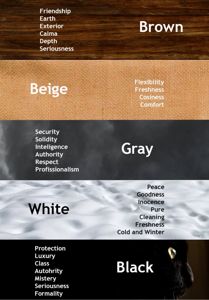
Neutral colours
Neutral colours are perfect for blends with hot or cold. They are great for backgrounds in Design and tend to soften the use of other colours.
Brown: Being associated with elegance and sophistication, it is widely used by interior design companies, gourmet stores, etc. It is also used by companies that sell organic products because it conveys the idea of nature and rusticity.
Beige: Beige is widely used in interiors, curtains, rugs, etc. as it gives the feeling of comfort and cosiness.
Gray: is the ideal choice for corporate environments as it conveys professionalism and responsibility. Like silver, it is used by technology companies, to convey modernity and innovation.
White: Provides harmony and lightness when combined with other colours. White is used in blogs and CTA’s, to give more prominence.
Black: it has several meanings, such as power, strength, elegance and mystery. It is used in printers, to stand out from the background colours and, therefore, to have more readability.
In conclusion, it is essential to understand the colours psychology so as to use it correctly in Marketing and UX Design.